Print design: Royal College of Music
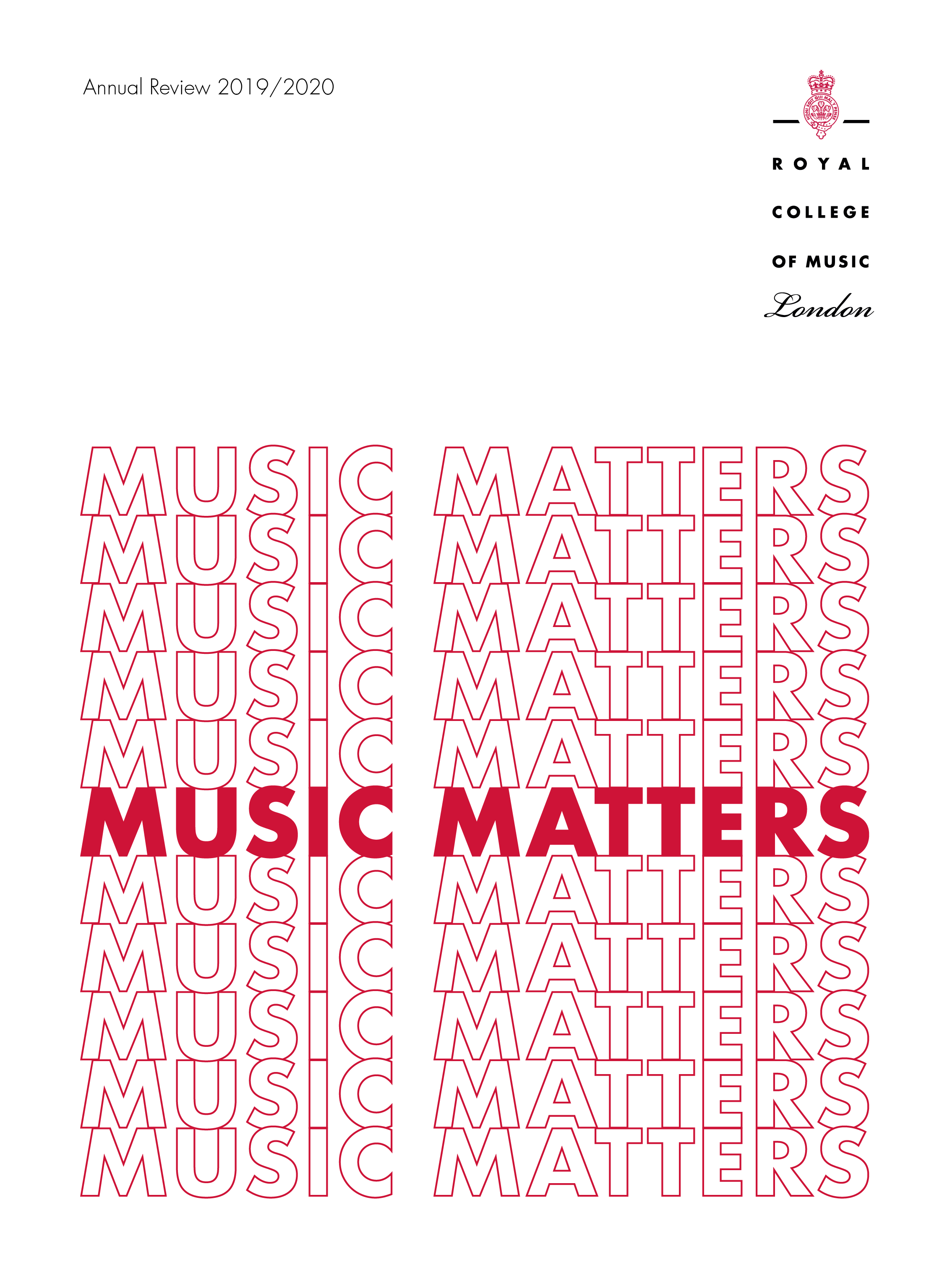
Annual Review 2019/2020 Cover
With the phrases ‘music matters’ and ‘play on’ to work with, I came up with typographical designs to encompass the feeling of 2020. At the height of the pandemic, it was a difficult year for all, musicians included.
The use of gradients illustrate the feeling of uncertainty and hesistancy at the beginning of the pandemic, which turns into strength and boldness as the importance and power of music is stronger than ever.
The design using ‘play on’ illustrates the resilience and drive to play on no matter what it takes or what form it takes.




RCM Students’ Union
Student feedback postcard
RCM and Philharmonia Orchestra at the Royal Festival Hall
Event leaflet for the Stravinsky: Myths & Rituals series
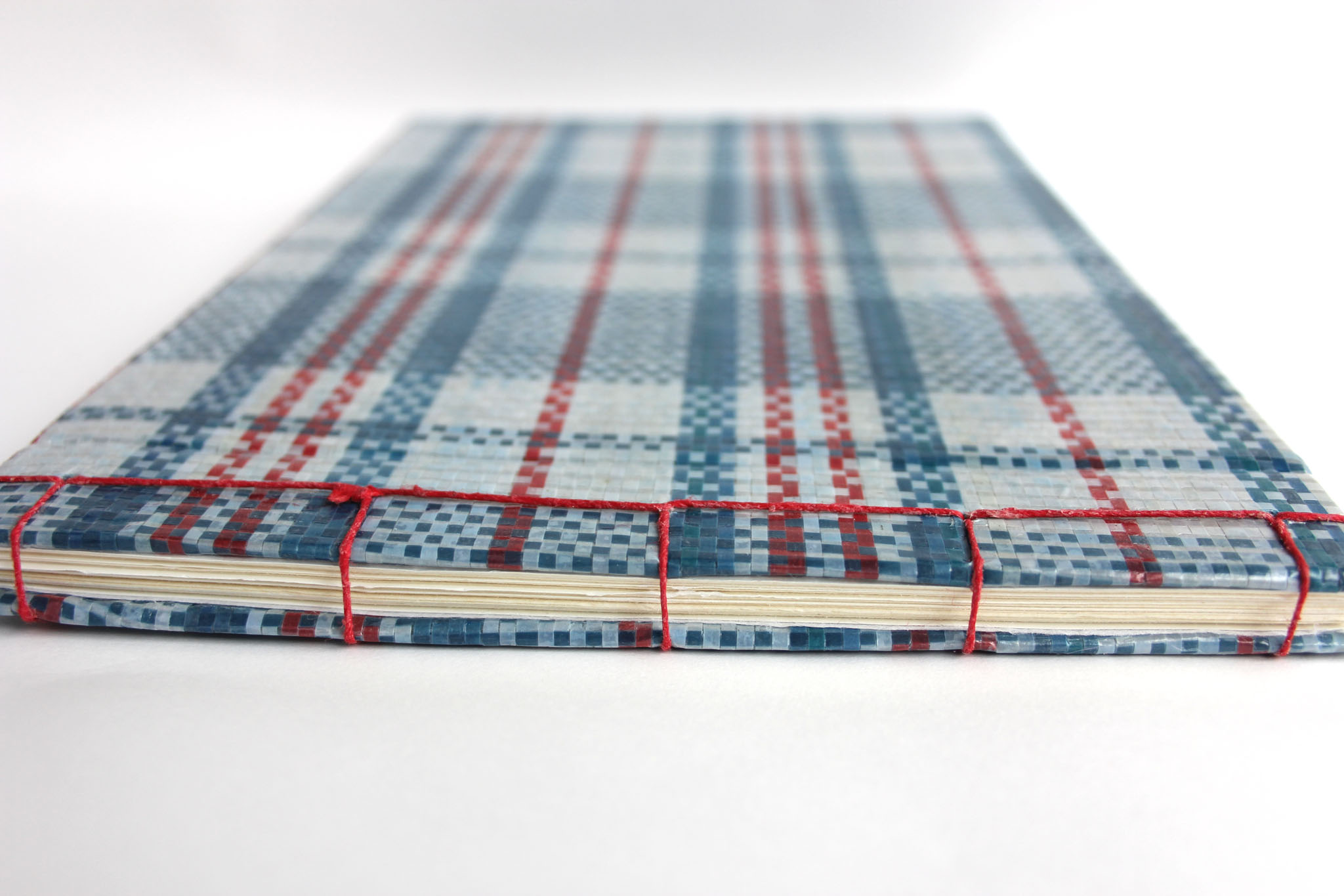
Book design: Acculturation
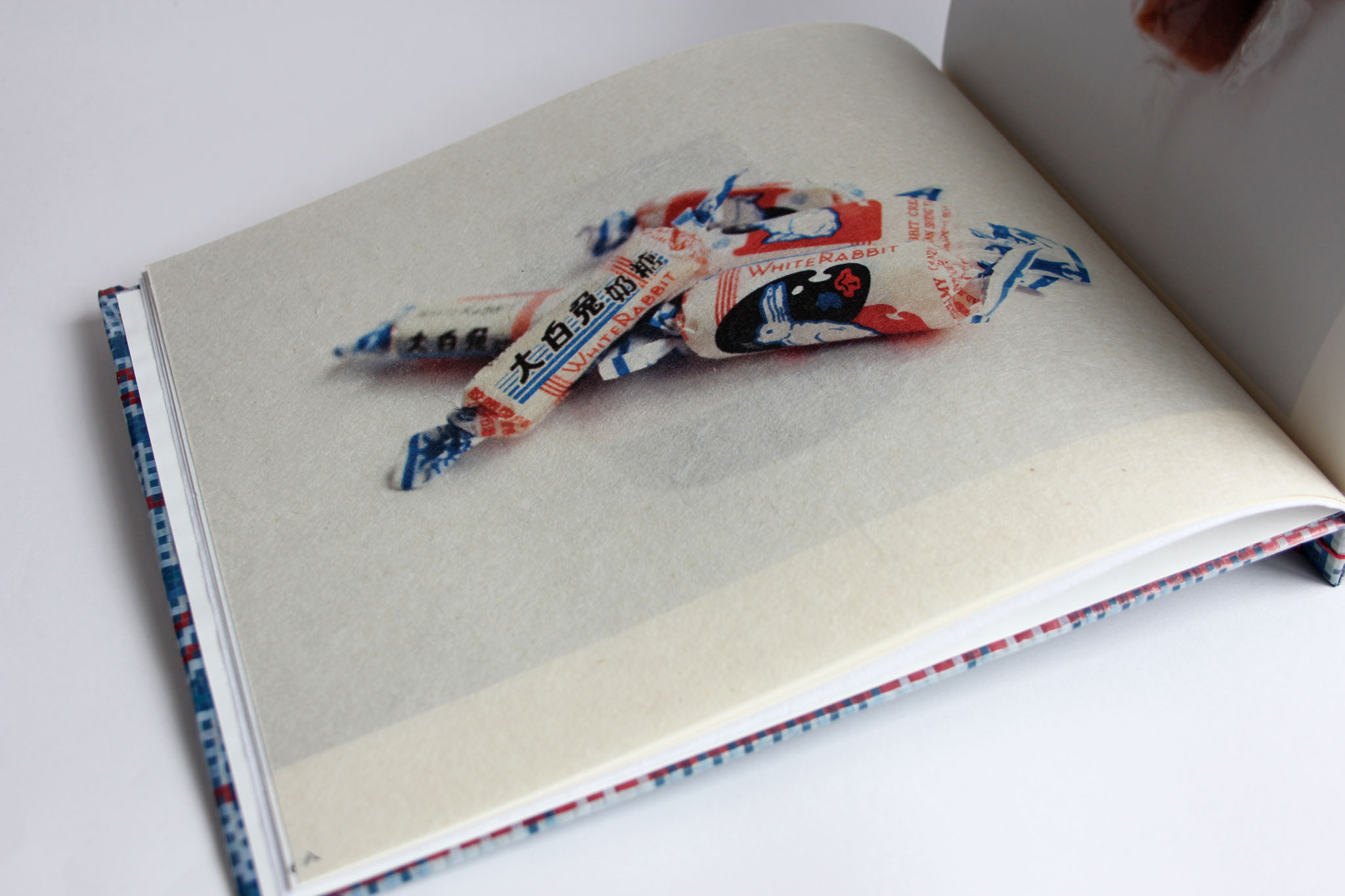
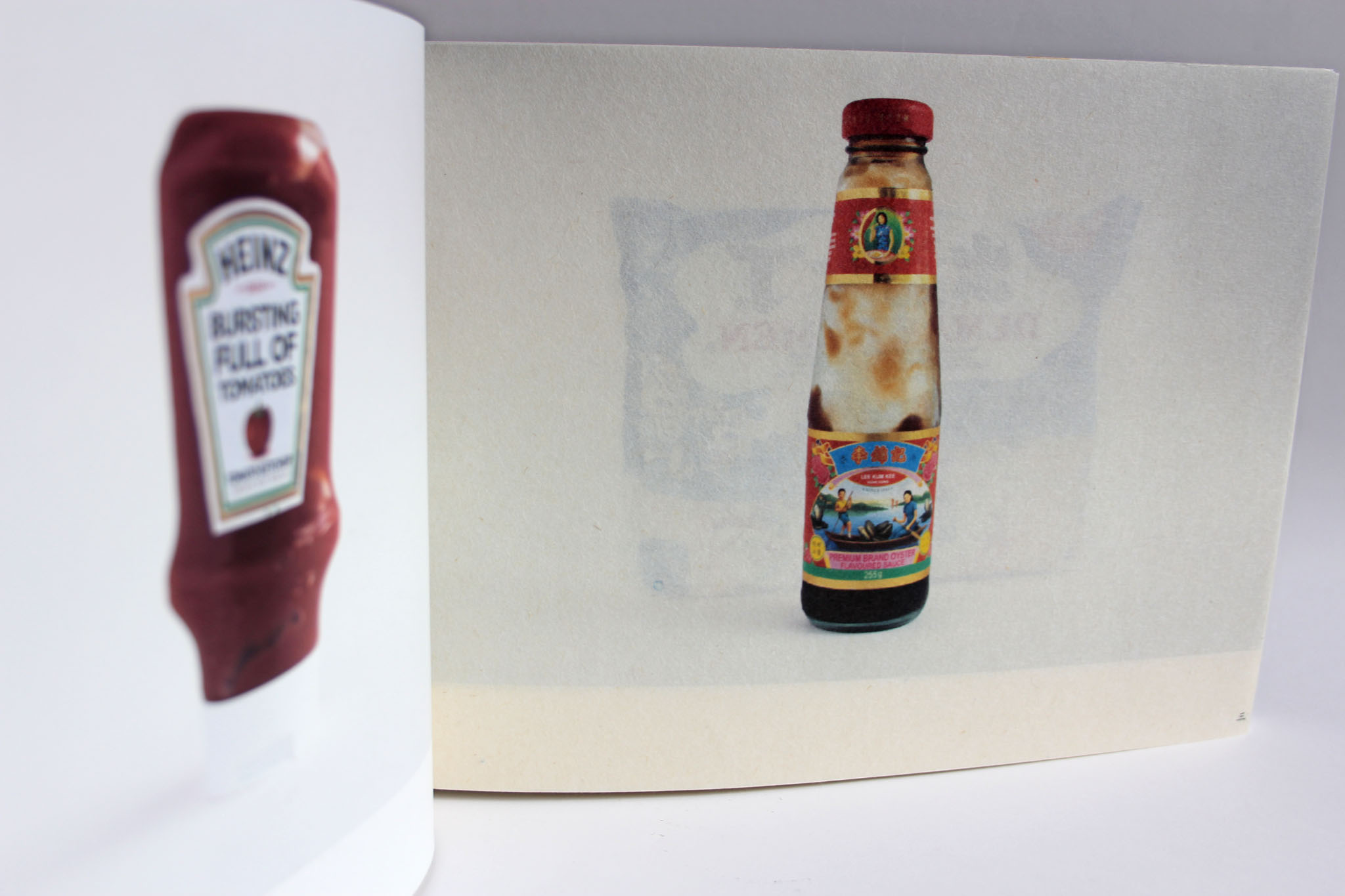
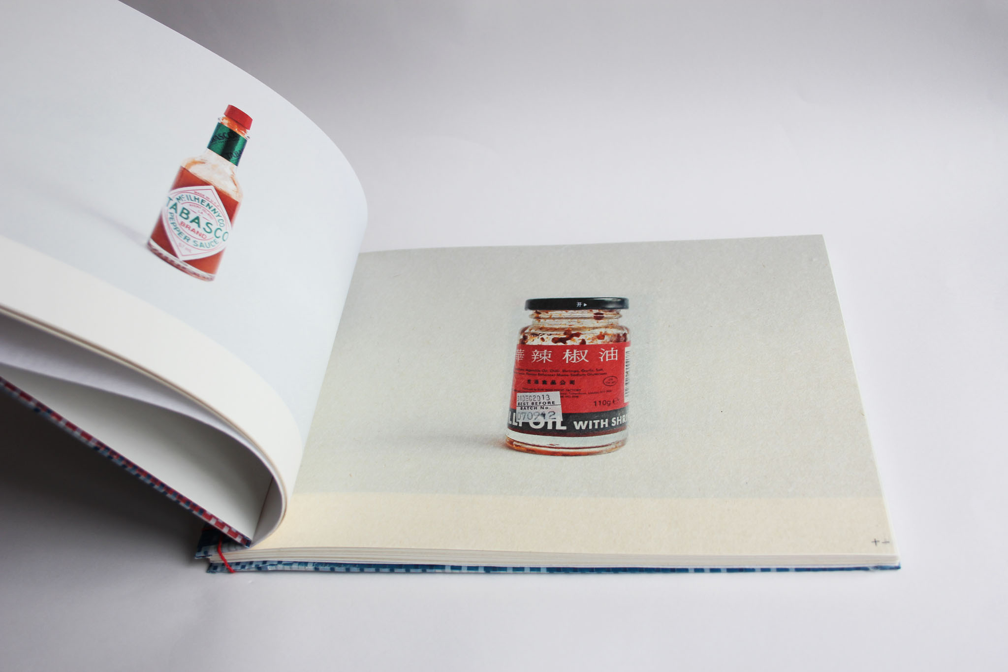
Being British born Hong Kong Chinese has led me to have a cultural identity crisis of some sort. The more I try to figure it out, the more I get confused. This is probably due to the fact that Hong Kong in itself has a unique cultural identity.
150 years of rule as a British colony, as well as political separation from mainland China has resulted in this unique cultural identity. Elements of traditional Chinese culture combining British Western influences has shaped Hong Kong in every facet.
Hong Kong was the last substantial colonial territory of the British Empire. British influence still endures: English remains an official language; road signs are clearly British in origin; road vehicles drive on the left and the British government structure has changed little.
There is also a Japanese influence on Hong Kong commercially and culturally. It is evident in the entertainment industry and youth culture. Everywhere you go there is a plethora of Japanese foodstuffs, products and merchandise.
Whilst pondering this dilemma of cultural identity, I began obsessively analysing objects in my life from both cultures ranging from everyday objects to things from my childhood, from which I created a catalogue of comparisons. These comparisons create interesting juxtapositions of cultural similarity and stark contrasts. It hasn't solved my dilemma but I have come to realise that having a deep understanding of both cultures is both beneficial and delightful.





Digital Typography
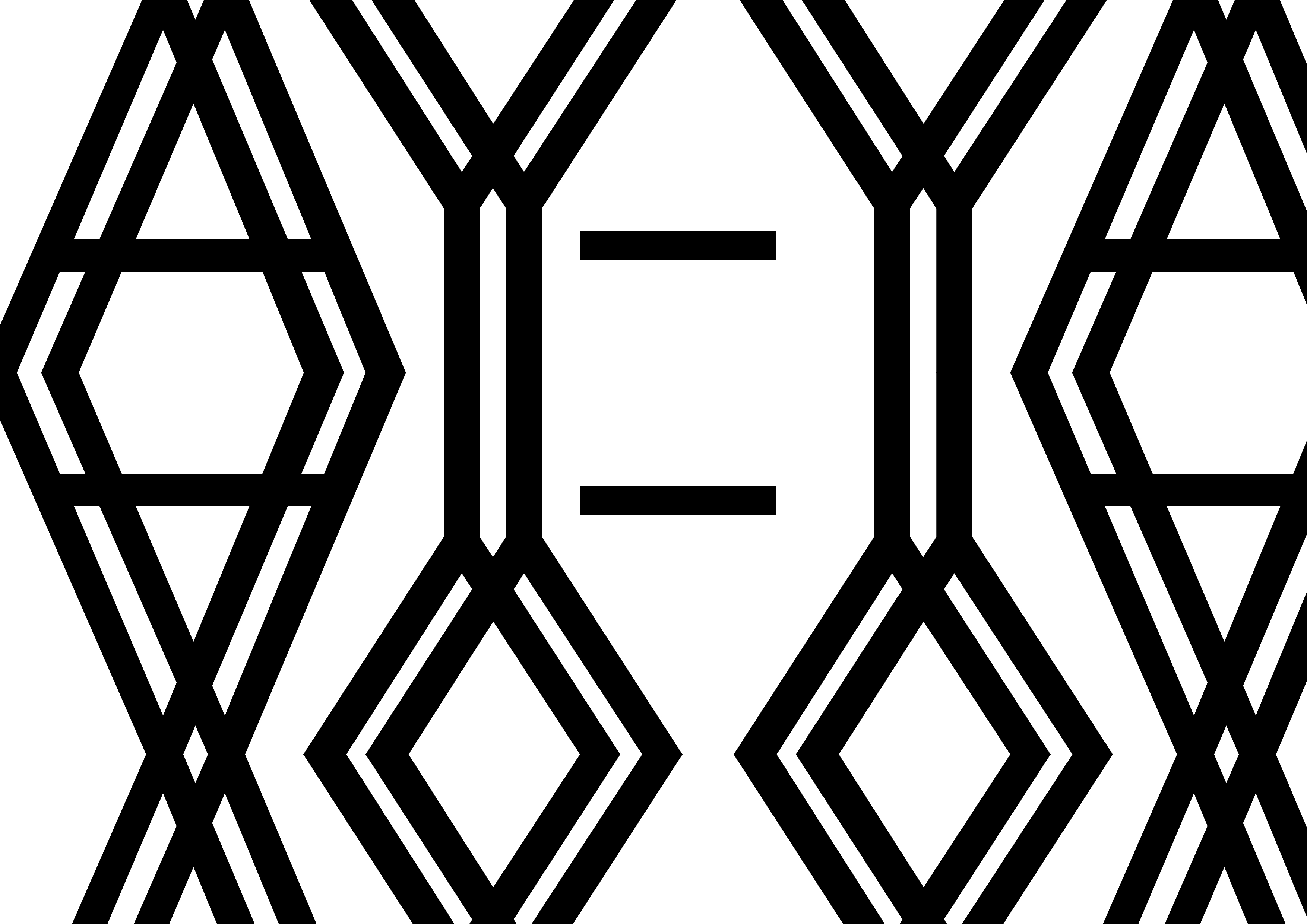
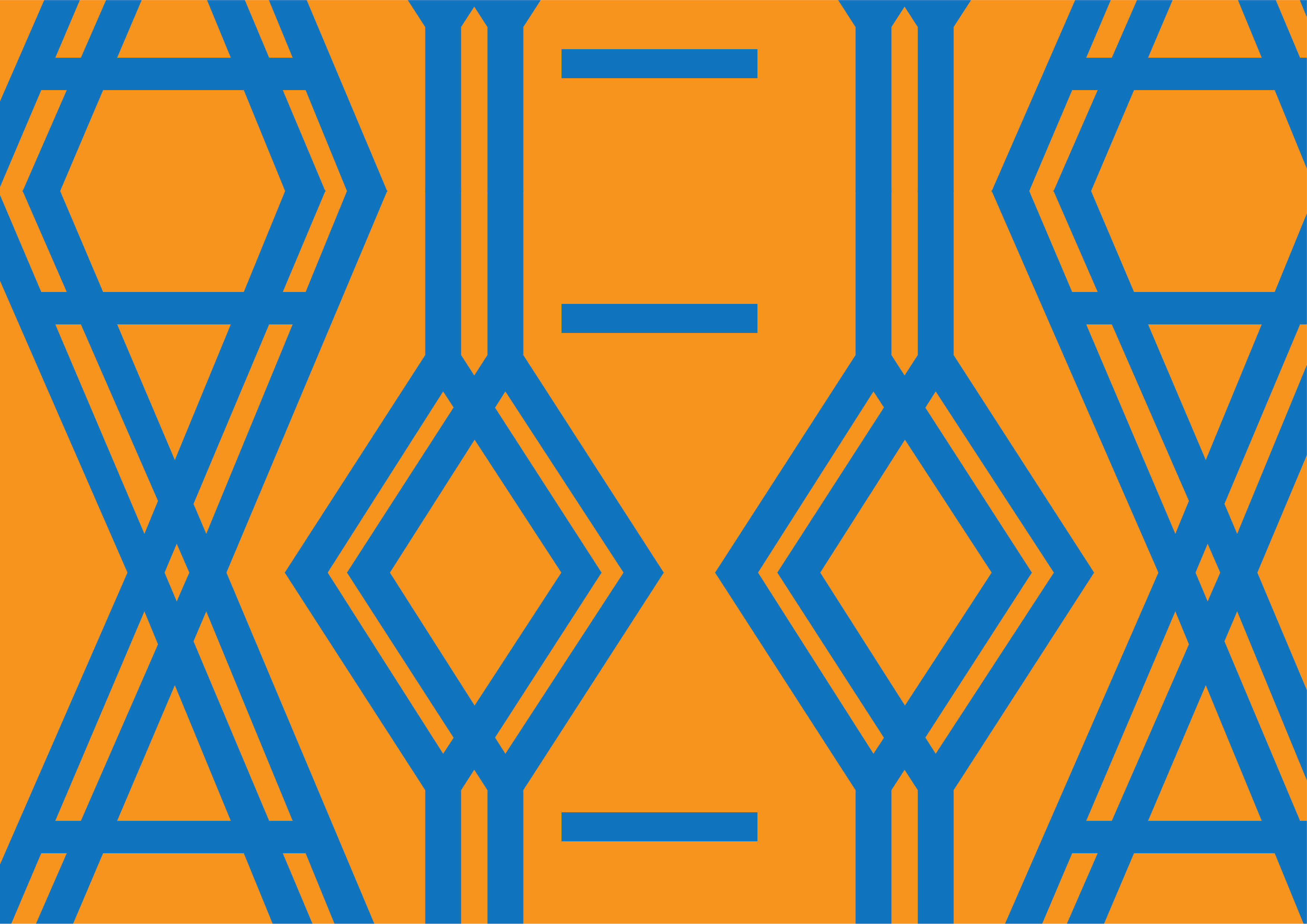
A simple brief to create typographical artwork using only the letters from my name. An exploration of typo/graphic shape and form with scaling, layering, repetition and masking.


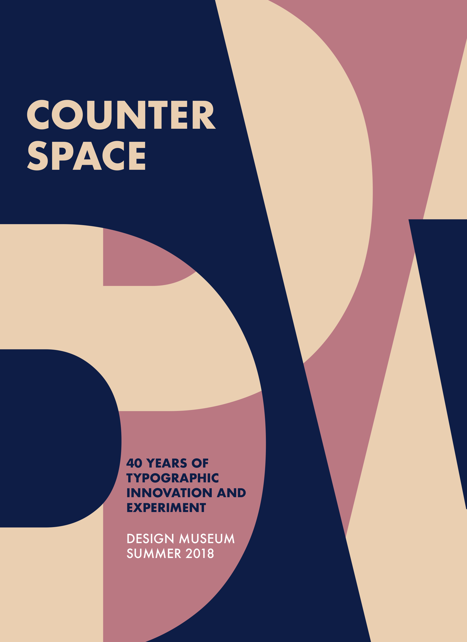
Counterspace poster
Design for typographic exhibition identity.
Investigating negative space through typographic form and counterform.
Digital design: Royal College of Music
Upbeat Magazine Web Design
Since 1904, the Royal College of Music has published a regular magazine celebrating the achievements of its students, graduates and staff. Under its current title Upbeat, the magazine is not only bigger and brighter than ever before, but distributed both and print and digital form worldwide and read by key figures across the music industry.
For the first time ever, in 2020, we had to adapt from producing a print version and to design an entirely new section on the RCM website to host the editorial content online. The aim was to have a design that was recognisable and coherent with the print magazine using the existing blog/web infrastructure, and also navigable and logical from a reader’s point of view, taking into account the multiple platforms on which it will be viewed.

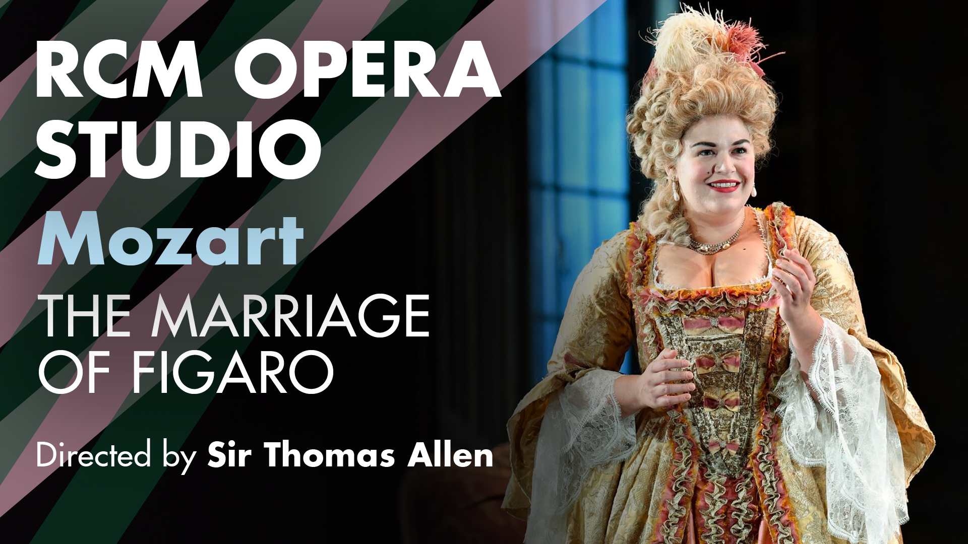
Summer 2020 RCM Online Concert Series identity
With no in-person events taking place in 2020, we shifted our focus to broadcasting online concerts.
The brief was to provide attractive artwork for video thumbnails viewed on YouTube. It was to sit alongside RCM’s wider suite of digital content, particularly the existing videos of performances and masterclasses.
This was a component of the 2020 RCM Community Campaign.

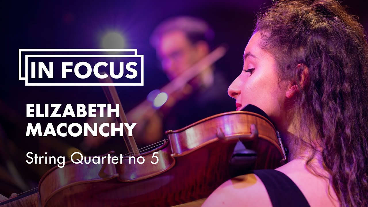
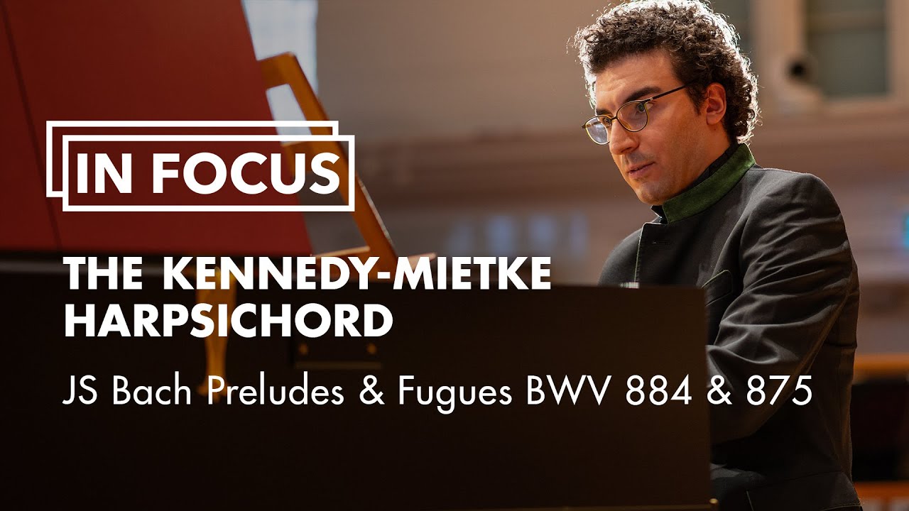
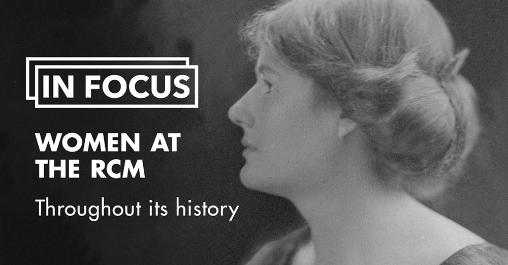
In Focus film series identity
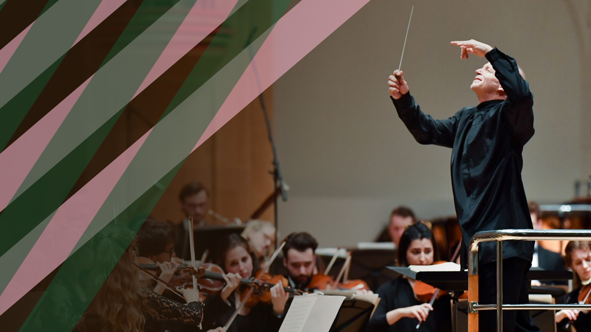
In a new series of specially commissioned films, the RCM presents a new way of experiencing classical performance. The In Focus series will allow viewers to experience the warmth, intimacy and richness of chamber music, wherever they are.
The brief was to design a typographical graphic for the In Focus series so that it is distinguishable from the rest of the autumn season. Used on YouTube thumbnails, social media channels and the video itself.

Royal College of Music Recruitment 2020: Intagram stories
Visual identity design for the RCM’s first ever Virtual Open Day and digital prospectus download.

Landscape
A series based the desire to recreate the feeling of taking in awe-inspiring landscapes. Inspired by Romanticism and Turner's paintings.
Mixed Media

